

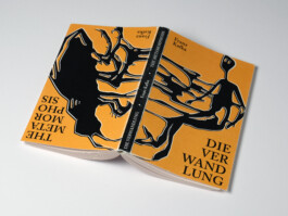
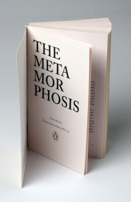
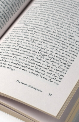
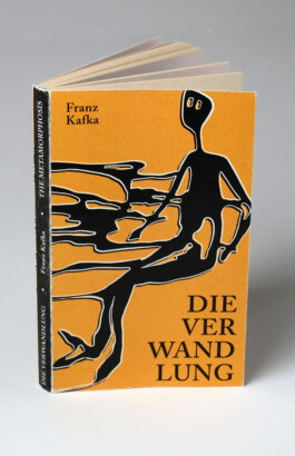
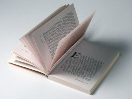
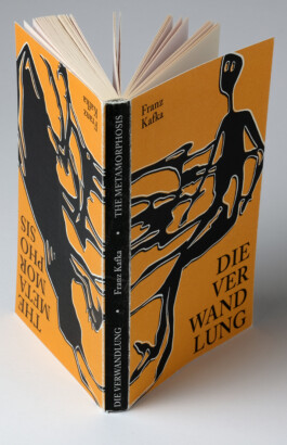
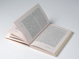
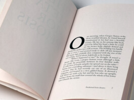
Editorial design for Kafka's novel 'The Metamorphosis' in two languages. As the novel can be read in German and English, the book can be read from two sides. The transformation from human to insect is already depicted on the cover. The project focused on microtypography. The layout was created based on the golden ratio, with an focus on readability. Adobe Caslon was used for the body text. I chose dark yellow and black for the cover to convey a sense of retro and blurriness. I also used white to create a feeling of displacement.


(BACK TO TOP)


Editorial design for Kafka's novel 'The Metamorphosis' in two languages. As the novel can be read in German and English, the book can be read from two sides. The transformation from human to insect is already depicted on the cover. The project focused on microtypography. The layout was created based on the golden ratio, with an focus on readability. Adobe Caslon was used for the body text. I chose dark yellow and black for the cover to convey a sense of retro and blurriness. I also used white to create a feeling of displacement.
(BACK TO TOP)
© MISA TANNER
© MISA TANNER